A change to BrainHQ is on the way—and it is beautiful!
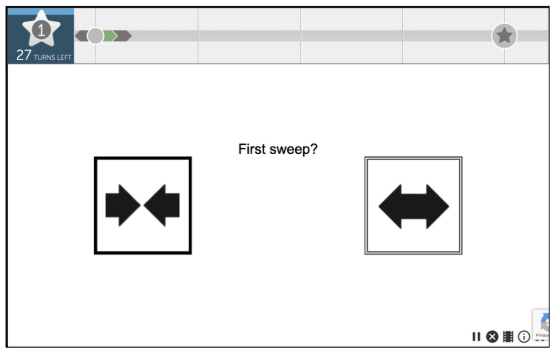
In the near future, the look of the BrainHQ exercises will be updated—with clearer buttons and appealing backgrounds. For instance, Visual Sweeps currently looks like this:

It gets the job done—but it’s a bit stark, and for a long time, our Art & Design team has wanted to do better.
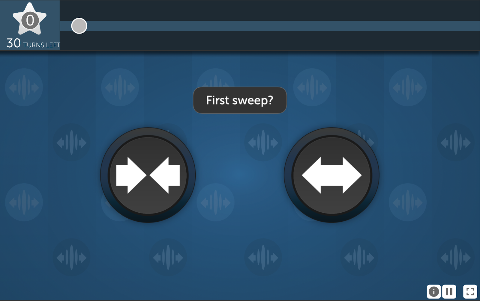
In the updated version, Visual Sweeps will look like this:

Exercises now have gorgeous backgrounds, with colors aligned to their cognitive domains. Text is larger, higher-contrast, and easier to read. And the buttons are consistent across exercises, and larger and easier to use.
What’s more, the “i” button at the bottom right of the screen will now give you three options:
- To review the written instructions on using the exercise
- To watch a video tutorial on the exercise
- To practice with the stimuli at that level (e.g., in Sound Sweeps, you can listen to “in” and “out” sweeps at your current speed over and over if you are struggling with the exercise itself)
None of these changes affect the functionality of the exercises themselves, so you can continue to train as they always have.
We think this update will make the exercises more intuitive to use and more appealing to view. We hope you do, too!


