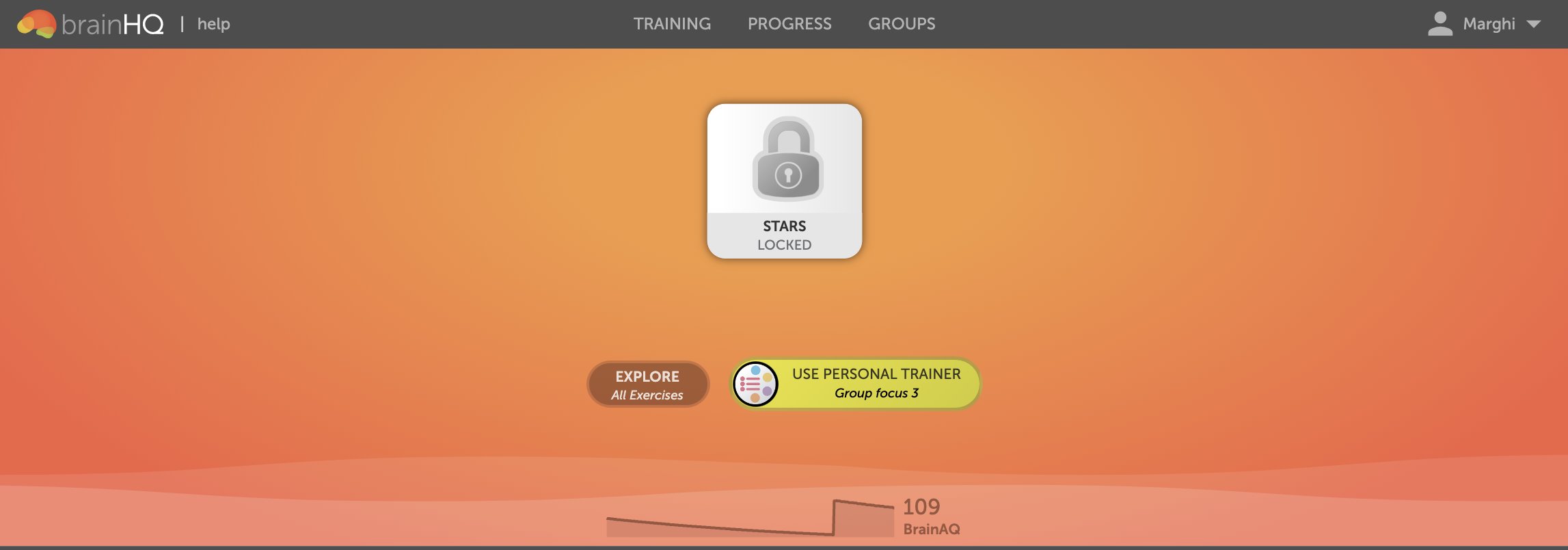
Here’s something you probably noticed: we have updated the BrainHQ training page! Instead of seeing a screen similar to this:

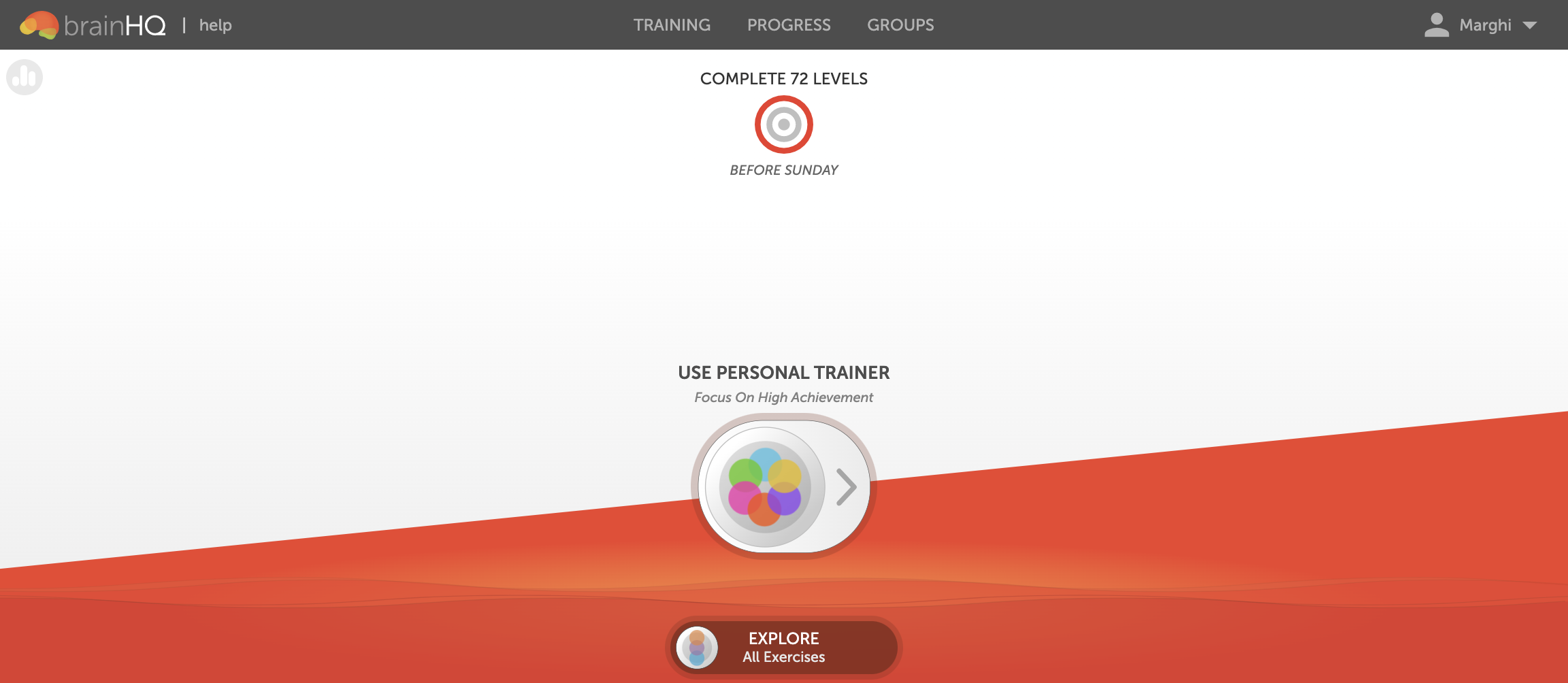
You will see something more like this:

The changes are mostly cosmetic–when you go to use BrainHQ, it should be easy to navigate as you did before. So why did we make this change?
- First, we wanted more contrast between the background and text to make it easier to read.
- Second, we wanted to give you a training goal right up front, and take away progress tiles that were locked or showed little progress (since those aren’t very motivating!)
- And third, the design lets us bring the design of our web site and our mobile apps into sync. Our iOS (iPhone, iPad) apps already have this design, and it’s coming to our Android app soon.
We hope you enjoy the new look!


